Shoven Says: Defer Social Security Benefits

John Shoven’s practical advice on when people should start taking Social Security benefits is rightly getting  increased attention. The economics is quite straight forward, and baby boomers should pay careful attention. So should the Social Security Administration. 

This table from John’s Policy Brief at the Stanford Institute for Economic Policy Research shows how much people’s benefits increase when they delay taking Social Security beyond age 62.   The increase is very large and for most reasonable calculations of life expectancy will easily offset the foregone payments, as John’s research with Sita Slavov shows.

Shoven Table 1

Yet, as this chart (also from John’s paper) indicates, most people to not delay benefits, and would thus be better off if they followed John’s advice. As John puts it “Social Security deferral is a good deal for most people.”

Shoven Fig 1

Of course, if more people follow his advice, federal spending and the deficit will be lower in the short run, but higher in the long run, unless offsetting changes are made.

Posted in Fiscal Policy and Reforms | Leave a comment

The Raisin Reserve: On the Way Out?

For many years I have used the California raisin market as an illustration of the effects of government intervention, even dressing up as a California raisin and dancing, as in the famous advertisement, to Marvin Gayes’ “Heard It through the Grapevine” on the lecture hall stage to show how crazy the policy is, as explained in this post. (Now that the ads are on YouTube I have retired my raisin costume, and simply show the ads in lecture.)  Under this intervention a group called the Raisin Administrative Committee takes an amount of raisins off the market and puts them into a “raisin reserve” reduce the supply and thereby increase the price of raisins.

But in the last few months, the strange practice has reached the national stage, with the Supreme Court hearing the case of a California farmer who refused to hand over his grapes and sold them instead. James Bovard wrote about it in a piece called “Dancing to the Beat of the Grapevine: The Raisin Farmers Seek Servitude Liberation.” He quotes Justice Stephen G. Breyer as saying “I can’t believe that Congress wanted the taxpayers to pay for a program that’s going to mean they have to pay higher prices as consumers,” with Justice Elena Kagan adding that it is “the world’s most-outdated law.”

Last month NPR’s planet money did a wonderful piece on the farmer and the Committee called “The Raisin Outlaw Of Kerman, Calif,” which is a must-listen-to. For video I recommend this CNBC piece Farmer Raisin Hell. Really great titles and a lot of outrage. Signs that the Raisin Reserve may be nearing its end.

Posted in Regulatory Policy | Leave a comment

Thanks for the Teaching Moment, Governor

Showing students how to analyze price floors and ceilings with the supply and demand model is an important part of the principles of economics course.  That was the scheduled topic for us in the course today and Governor Jerry Brown provided us with a big teaching moment when he signed into law yesterday a new $10 minimum wage for California to be phased in over the next three years. Unless there are big changes elsewhere, it will be the highest in the country—33 percent higher than the federal minimum wage.

Of course the diagram is simple, and not surprisingly led to a great deal of interesting discussion inside and outside the classroom.

min wage S&D modelA government mandated minimum wage above the market wage creates a gap between the quantity of labor demanded by firms and the quantity of labor supplied. The higher the minimum wage the lower the quantity of labor demanded and the higher is the unemployment rate for affected low-skilled workers.   The debate among economists is whether the decline in employment is significant, a debate which can be simply illustrated by drawing in a very inelastic labor demand curve in the diagram.

There’s still a lot of disagreement among economists about the empirical evidence, but in a recent review paper, David Neumark, Ian Salas, and Bill Wascher sensibly “conclude that the evidence still shows that minimum wages pose a tradeoff of higher wages for some against job losses for others, and that policymakers need to bear this tradeoff in mind when making decisions about increasing the minimum wage.”   I didn’t hear many Sacramento policymakers saying much about this tradeoff in the months and days leading up to yesterday’s vote. 

Posted in Regulatory Policy | Leave a comment

A New Economics 1 at Stanford

Tomorrow Stanford embarks on a new principles of economics course at the introductory level. For the first time since the financial crisis we will be teaching the course in one term. I will be doing the inaugural course consisting of 35 fifty-minute lectures assisted by a team of teaching fellows who will lead 10 additional small discussion sections throughout the term.

We are moving to a single one-term course that combines micro and macro from two courses–one on micro and one on macro–for a number of internal reasons, including the need to provide a complete one-term course for students not majoring in economics. In fact, before Stanford offered a two-course sequence, it offered a one-term course for many years, so it is not entirely foreign to the curriculum.

In my view, there are also pedagogical reasons to make this change.  I think it is time for a course that better integrates micro and macro. There were arguments for doing this before the crisis, including the fact that in research and graduate teaching the tools of micro have been better integrated into macro, but the financial crisis clinches the case in my view. The crisis along with the slow recovery and other associated changes is the biggest economic event in decades, and it can only be understood with a mix of micro and macro. To understand recent events one must know about supply and demand for housing (micro), interest rates that may have been too low for too long (macro), moral hazard (micro), a stimulus package (macro) aimed at such things as health care (micro), a new type of monetary policy (macro) that focuses on specific sectors (micro), debates about the size of the multiplier (macro), excessive risk taking (micro), a great recession (macro), and so on. It you look at any explanation of the crisis and the slow recovery, you’ll see a mix of micro and macro.

Moreover, the introductory course can be integrated in a way that makes economics more interesting for students. I have been experimenting with this. When I talk about aggregate investment demand I say it came right out of the micro demand for capital. Similarly aggregate employment and unemployment can be explained in the context of micro labor supply and demand. The proof that aggregate production (GDP) equals aggregate income can be stated at the time one defines profits as equal to revenues minus cost of labor and capital. The demand for money as a function of the interest rate is easily explained with the opportunity cost concept.

I think this approach works no matter what your view is of the crisis and the policy response. In my view the problem was that economic policy deviated from basic economic principles which had worked well. The result was a great recession, a financial panic, and now a slow recovery. The deviations included a monetary policy which set interest rates too low for too long and a regulatory policy which failed to enforce existing rules. The deviations from sound principles then continued. The good news for the economy is that economic growth and stability can be restored by adopting policies consistent with basic economic principles.

Of course there are other views, but the heated disagreement among economists about the crisis, its causes, and its aftermath presents a great opportunity to make economics more interesting.

By the way, 35 lectures in a one-quarter term may seem like a lot, but that is one reason why we can take this approach. In contrast, the macro principles course at Princeton has had only 12 lectures in a semester and the micro principles course has had 24 lectures.  I understand that the Economics 10 course at Harvard has only about a half dozen lectures per semester by the main professor, with guest lecturers filling in for another half dozen.

Posted in Teaching Economics | Leave a comment

Fed Policy: The Good, the Bad, and the Ugly

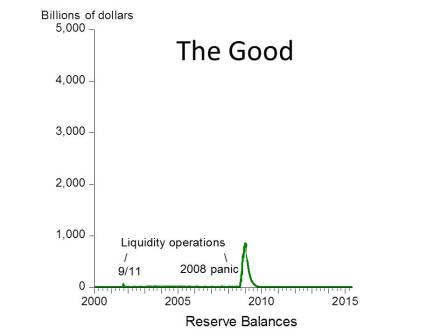
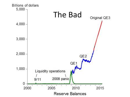
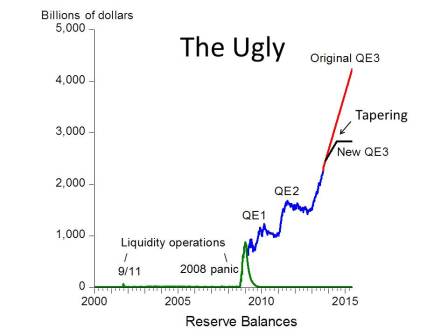
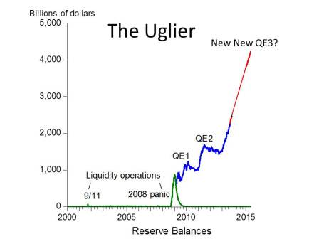
Last week I was invited by Macroeconomic Advisers to participate in their interesting annual Washington Policy Seminar, and to be on a panel with Larry Meyer. They called the panel: “Fed Policy: The Good, the Bad, and the Ugly.”  So I prepared a few charts on the Good, the Bad and the Ugly. Since then I have prepared a fourth chart: the Uglier.

Chart 1 is the Good. It plots the amount of Fed-supplied liquidity (measured by reserve balances of the banks at the Fed).  It shows the increase in liquidity at the time of the 9/11 terrorist attacks of 2001, when the payment system was physically damaged, and also the increase in liquidity at the time of the panic of 2008.  These actions represent good monetary policy in the sense that the Fed acted in its lender-of-last resort capacity to provide liquidity in times of stress.  You can see that the injection around 9/11 was properly short-lived. Although the lender of last resort facilities for the panic of 2008 were also short-lived (as shown in the graph), the total amount of reserves was not. The liquidity provisions did not end as in the Chart 1. Instead we got Chart 2.

The Good

Chart 2 is the Bad. It shows the explosion of liquidity due to Quantitative Easing (QE) 1 and 2 (blue line) and the recent sharp increase due to QE3 announced in September and December of last year. The blue is what has already happened and the red is a continuation the original QE3 based on the hypothesis that the $85 billion per month would continue until labor market conditions improved (which originally could have been taken to be 6.5% unemployment rate).

The Bad

Chart 3 is the Ugly. It shows the first tapering announcement only 5 months after the start of the original QE3. Long term interest rates—which never really fell with QE3—were now on the rise.

The Ugly

Chart 4 is the Uglier. It shows the surprise abandonment for now of the New QE3, and the start of a  New New QE3. Who knows when and if that will end.

The Uglier

Posted in Monetary Policy | Leave a comment

Debt Explosion Unchanged: Looks the Same as Five Years Ago

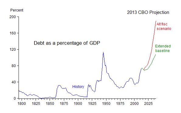
The CBO’s 2013 Long-Term Budget Outlook released this week made a lot of news because it appeared to paint a new and surprisingly bleak budget picture. But in reality, the budget outlook is little changed from CBO’s long-term budget outlook of last year or the year before. Indeed the long-term outlook is nearly identical to what CBO forecast in 2009, which reminds us that little progress has been made in the past five years. The projected debt explosion is just as bad now as in 2009.

Part of the confusion is that this year’s CBO report essentially ignored the “alternative fiscal scenario” assumptions compared to previous years. Instead it focused almost entirely on the “extended baseline” assumptions, which are less realistic about the likely future stance of government policy. Comparing the budget with the “alternative fiscal scenario” with the “extended baseline” is an apples and oranges comparison.

The chart below is an “apples to apples” comparison which uses the “alternative fiscal scenario” assumptions for both the 2013 long-term outlook and the 2009 long-term outlook.  It shows the CBO forecast of debt to GDP ratio. It also shows some history.  I have been using this type of chart in posts since the 2009 projections were made.

debt 09-13

Note that the projected future debt explosion is almost the same now as it was in 2009. The main difference is that CBO has cut off its projection earlier and does not report the numbers beyond 2038.  But the 2013 outlook is at least as explosive as the 2009 path. Clearly we have not “fixed the debt.”

The reason for the change in emphasis, as CBO explains, is that “The American Taxpayer Relief Act of 2012 extended indefinitely a number of tax provisions that were scheduled to expire and indexed the alternative minimum tax (AMT) for inflation, making some components of the previous years’ alternative fiscal scenarios part of the extended baseline.” But there is still a big difference, as the next chart which goes out to 2038 illustrates. So if you want to see whether the budget outlook has gotten worse or not, it is better to use the same assumptions.

debt 13 comp

Posted in Budget & Debt | Leave a comment

With Better Policy, the Recovery Could Have Been V-Shaped

Some are still arguing that the prolonged slow recovery from the deep recession of 2007-09 was to be expected. Fast rebounds, or V-shaped recoveries, are a thing of the past, they argue, citing the recovery from the 2001 recession as evidence. For example, Paul Krugman argues that a “V-shaped recovery was not in the cards, precisely because prolonged jobless recoveries had already, pre-2008, become the new normal.”

However, the recession of 2001 was shallower and milder than the average U.S. recession and so was the recession in 1990-91. Slower recoveries from such shallower recessions are not unusual; there’s nothing new normal about them. The current weak recovery is unusual because it followed a deep recession. And the fact that the recession was associated with a financial crisis does not invalidate the historical  regularity that deep recessions are usually followed by V-shaped recoveries. The chart below, which I have used before, shows that growth following recessions associated with financial crises is regularly rapid for a few years after the downturn, which creates the V-shaped pattern. f0e74-graph06

In my view, the reason for the current slow recovery is poor policy, not anything inherent or newly normal about the economy. With better policy, we would likely have seen the typical V-shape.

Posted in Slow Recovery | Leave a comment

Four Posts Within a Post Remembering 9/11

Here are four posts recalling life in the U.S. Treasury on 9/11 and afterwards

Flying Back to Treasury on 9/11: I was in a hotel room in Tokyo when the first plane hit the World Trade Center, recently sworn in as Under Secretary at Treasury…We immediately cancelled our meetings and by the next morning—still 9/11 in the United States—we were on a C-17 military jet flying back to America…When I got back, the city was on alert. DC was a logical place for another attack, and the secret service was particularly concerned about security around the White House and the adjacent buildings which included the Treasury. We planned for the worst case scenarios. We made lists of essential jobs that would have to be done if the Treasury was wiped out—running the $30 billion Exchange Stabilization Fund case we had to intervene in the currency markets was an example…. read compete post

The Financial Front in the War on Terror: Few Americans now remember that the United States launched its first post-9/11 attack on terrorists from a very unusual front—the financial front. As President George W. Bush put it, “the first shot in the war was when we started cutting … read compete post

A Morale Booster on the Financial Front Too: Anyone who has served in the military during the nearly ten years since 9/11 must feel a sense of closure with Bin Laden’s death. As Lindsay Wise writes in the Houston Chronicle “Bin Laden’s death is a dramatic morale booster… read complete post

On the New Greatest Generation: With the 10-year anniversary of 9/11 approaching people have been asking me to write about the impact of 9/11 on economic policy making in Washington, where I ran the international division of the U.S. Treasury at the time, and to …read compete post

Posted in International Economics | Leave a comment

My Take on the Middle-Out View

Here is my Wall Street Journal column.  If you’re interested in the of path of incomes year by year, the chart below shows real income growth for the 90% and 10% income groups.

saez real income 1090

The data come from Emanuel Saez’s web site. The data are based on income reported to the IRS and thus may change relative to actual income when tax laws change. Also the data are pre-taxes and pre-transfers. The following chart from CBO shows that the change in income inequality, as measured by the change in the Gini coefficient, is about the same whether or not taxes and transfers are included.CBO Gini changes

Posted in Regulatory Policy, Slow Recovery | Leave a comment

A Monetary Policy Rule That Works: Powerful New Evidence

In a recent paper (summarized here) Alex Nikolsko-Rzhevskyy, David Papell, and Ruxandra Prodan applied statistical tests to identify periods in recent U.S. history when Fed policy was “rules-based”—which they define in practice as Taylor rule periods—and periods when it was discretionary—which they define as non-Taylor rule periods. (They used both a structural change test and a Markov switching test).

Their statistical identification procedures were not based on which periods had better economic performance, only on measures of monetary policy actions.

But now they have now gone back to the data to determine whether the rules-based or discretionary periods delivered better economic performance.  This morning David Papell sent me the following table summarizing their latest results.  For three different performance measures, panels A, B, and C in the table show that Taylor Rule periods had far better economic performance than non-Taylor Rule periods.

Rules versus Discretion Loss Functions

Posted in Monetary Policy | Leave a comment