If history is any guide, we are about to hear scores of scare stories about the harm caused by the spending reductions in the 2011 budget resolution (H.R.1) passed by the House early this morning. Maybe you’ve already heard how the budget threatens the “daily operations of National Weather Service.” In assessing these claims, it is very important to recognize and to emphasize that in 2009-10 we had an unprecedented binge of federal spending. The simplest way to understand the proposed budget is that it largely (not completely) undoes this two-year binge and brings spending back to about what agencies had to spend in 2008. If the government budget was enough for federal agencies—such as the Weather Service—to operate in 2008, then how can one claim that they cannot operate with roughly the same budget now?
The two charts help illustrate this. They focus on the non-defense non-security discretionary part of the budget, which has been the focus of the 2011 budget debate so far. Of course the other parts of the budget must be addressed starting with the 2012 budget, but if we cannot have a fact-based principles-based discussion of the 2011 budget, it will be virtually impossible to resolve the longer term issues.
The first chart compares the 2011 House budget appropriations (passed the House this morning) with appropriated spending in the 2008 budget enacted in December 2007. Note how the proposed 2011 levels are close to but slightly higher than the enacted 2008 levels. In fact they are about 5 percent higher which is more than enough to keep up with inflation during this period. The chart also illustrates the recent spending binge with the 2011 levels proposed in the Administration’s fiscal year 2011 budget. Clearly the House budget proposal represents cuts from the binge but not relative to right before the binge. 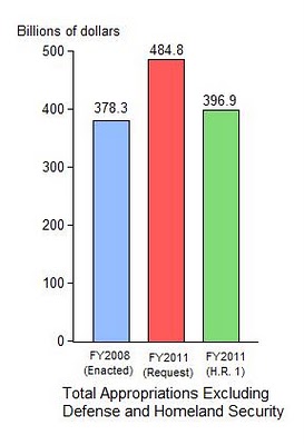 The second chart divides the appropriated spending into nine budget categories (other than defense, homeland security, and military construction). The chart shows how close the 2011 proposal is to 2008 for each category, with some higher and others lower. Of course there will be understandable disagreement between Republicans and Democrats about the composition of spending between and within these budget categories, and this will be a reasonable subject for debate with the Senate and the President. But I think these data show that a reasonable compromise would be to keep the overall totals as in the House proposal and thus take a first important step toward restoring fiscal sanity.
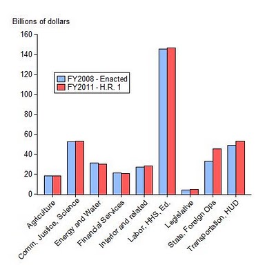
 But a very important question going forward is what will be the base for discussing budget proposals in 2012. If one keeps to the logic of the House leadership, then the base to reduce from should be $485B, not $537B, as shown by the dashed line. To complete the reversal of the spending binge, 2012 spending would be brought down to 2007 levels of $459B, which would be a 5 percent reduction from the appropriate 2011 base.
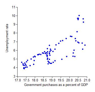

 In sharp contrast, the data on spending shares show that the most effective way to reduce unemployment is to raise investment as a share of GDP. The second chart shows the relation between unemployment and fixed investment over the past two decades. Higher shares of investment are associated with lower unemployment.
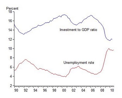
  The time series in the third chart show the relationship from another perspective. Either way you look at it, the relationship between unemployment and the investment share is remarkably close. It holds for both non-residential and residential investment, and is a subject of my current research. Of the four shares of GDP (the other two of course being consumption and net exports), the investment share shows by far the largest negative association with unemployment.