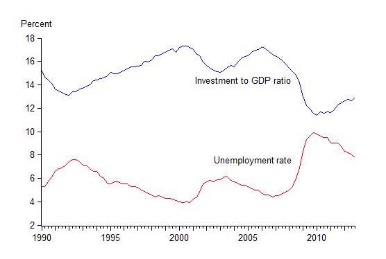
When the recovery was getting started I pointed out the remarkably strong inverse relationship between fixed investment as a share of GDP and the unemployment rate, and argued that a policy that focused on getting businesses to invest more would help get the unemployment rate down.
The additional data from the past several years gives us a chance to check whether that relationship has held up. As shown in the following two charts, it has held up quite well. The first time series chart shows that as investment has turned up as a share of GDP, the unemployment rate has fallen. The increase in fixed investment thus far has been largely in the form of business fixed investment, though residential started to pick up last year.
The second chart is a scatter plot with unemployment on the vertical axis and the investment ratio (in percent) on the horizontal axis. The lines connecting each quarterly observation represent the path from one quarter to the next. The chart illustrates the close correlation between the two variables. It also shows that the movement of unemployment and the investment ratio during the recovery (the recent dates are marked) has roughly paralleled the path in the recession, but in the reverse direction. The problem, of course, is that the reverse path is way too short. Investment has increased very slowly and has a long way to go before it gets back to levels that correspond to the 5 percent range for unemployment that we would like to see. So the message in the charts is much the same as several years ago: economic policies that focus on more private investment are likely to also reduce unemployment.
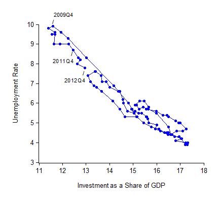
These diagrams would look very much the same if the denominator in the investment ratio was potential GDP rather than actual GDP. Of course, things other than investment can affect unemployment, and the correlation does not prove causation. As I pointed out here in a reply to comments on my original post, the correlation between investment and unemployment was also strong in the 1970s, through the scatter of points would be higher in the diagram then because demographic factors raised the average rate of unemployment.