Notches and Disincentives in the Health Care Law

My colleague Dan Kessler writes in today’s Wall Street Journal that Obamacare creates large disincentives to work. I’ve found the following graph useful for showing students why. (The same type of graph is used in of my economics text Chapter 14, p 4o4) 
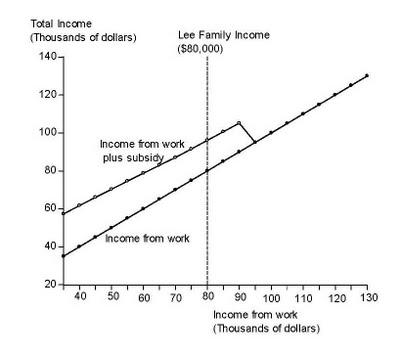
The graph shows income from work and the corresponding health care subsidy for a family of 4 headed by a 55-year old. The subsidy is paid to households earning up to 400 percent of the poverty line. With a poverty line of about $23,300 for a family of 4 in 2014 (when the legislation goes into effect) families earning as much as $93,200 will get a subsidy.

Observe how the subsidy declines with income and then is slashed to zero when 400 percent of the poverty line is hit. You can even see the V-shaped “notch” in the graph, which has become the technical term used to describe such sudden drops in subsidies. Consider the Lee family, for example. They earn $80,000 and thus get a subsidy of $16,100, bringing their total income to $96,100. But suppose they decide to work more. If they increase their income from work by $14,000, bringing their work earnings to $94,000, then their health care subsidy drops to zero. So they get less income by working more, and that’s a big disincentive.

Posted in Regulatory Policy | Comments Off on Notches and Disincentives in the Health Care Law

On the Budget Debate People Are Saying “All We Want Are the Facts”

  • This graph from my Friday Wall Street Journal article simply presented basic facts about the second Obama budget and compared it with the first Obama budget and with the House budget.
  • So why did it attract so much attention here and here and other places? I think it’s a sign that people are tired of rhetoric and demagoguery. They want to understand each side’s factual position in the debate. “All we want are the facts, ma’am,” as Joe Friday would say. My guess is that people would like it if President Obama or Members of Congress took one or two charts to the town hall meetings or to the Sunday morning talk shows. Sometimes you hear the excuse that charts are too technical, but that certainly doesn’t apply to the techies at the Facebook town hall last Wednesday.
  • Still some have asked good questions about how to interpret my chart. Some thought it is misleading to plot government spending as a percent of GDP. But that’s not unique to my chart, and in fact it’s pretty conventional. CBO and OMB regularly report spending this way. For example this recent CBO report on the first 2012 Obama budget measures outlays as a share of GDP (See Table 1-2 on page 4). Regarding recent history Table E-2 of this CBO historical data set presents the history of outlays as a share of GDP both before and after the recession. The point of my article is that there was a spending binge and that the binge would continue with the Administration budgets, and I think the chart showed that accurately.
  • Here is what my chart looks like if you do not divide spending by GDP. It reminds us that the under the House budget spending continues to grow, but less rapidly than the two Obama budgets. You can still see the spending binge of the past few years but the upward trend makes it harder to visualize.
  • Another question is why I did not include zero percent of GDP in scale of the chart. I teach Economics 1 students at Stanford to look at the scale of axes carefully, but I do not think it is misleading to choose the scale I did. If you are interested in what is happening to the stock market in the past few months, you do not plot the S&P 500 with a chart that includes zero. If you did you would not see much of anything on a day to day basis. For the record here is a version of my budget chart which includes zero. The story is the same, but the ups and downs are scaled down and are harder to see.
Posted in Budget & Debt | Comments Off on On the Budget Debate People Are Saying “All We Want Are the Facts”

Why a Lack of Transparency in the Administration’s Budget II is a Problem

  • A transparent budget proposal—such as the Administration’s first 2012 Budget presented by President Obama on February 14 or the House Budget presented by Paul Ryan on April 6—contains year-by-year tables showing the proposed path for government outlays over time. These are needed to estimate the economic impact of a budget and assess its credibility.
  • But the second Administration budget for 2012 and beyond presented by President Obama this week contains no such information, either in the speech or in the fact sheet to go along with the speech. How can one determine the impact of a budget on the economy if one does not know the path of proposed spending? This lack of transparency is not simply an issue for policy wonks as William Galston of Brookings explains in his critique of the Administration’s Budget II. It raises questions about the credibility of the budget process.
  • To illustrate the issue in concrete terms I “reverse engineered” one possible year-by-year path for government spending over the next ten years that is consistent with the information in the speech and the fact sheets on the Administration’s Budget II. In particular the path reduces the deficit by $4 trillion over 12 years compared to Budget I and there are three dollars of spending cuts and interest savings for every one dollar of tax increases. In other words, under Budget II, spending would be down by $3 trillion relative to Budget I over 12 years. The resulting path is one of several possibilities because one cannot go uniquely from a multiyear total to year-by-year amounts. The path calculated here for Budget II may have more spending up front and less in the out years compared with actual Budget II, but we do not know for sure because the budget is incomplete as presented.
  • The path for government outlays as a share of GDP under Budget II is shown in this graph along with the Administration’s Budget I, the House Budget, and recent history. 
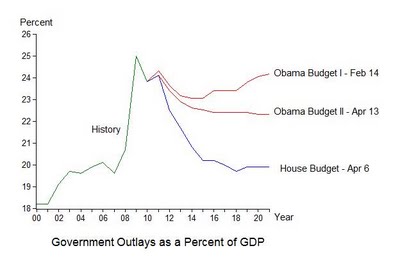
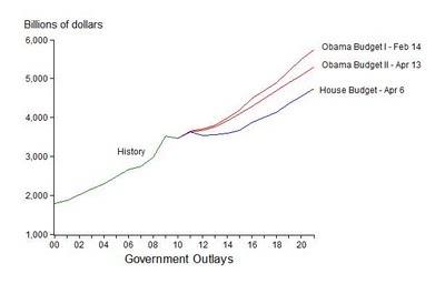
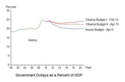
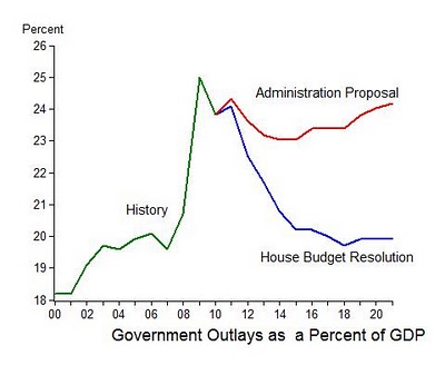
The graph focuses on the next 10 years because that is the frame of reference for Budget I, the House Budget, and the current budget process. It is important to note, however, that my calculations imply that $1 trillion of the $3 trillion outlay reductions in Budget II compared with Budget I occur in the two years after the 10 year window. So in reality the proposed reduction in spending growth is $2 trillion rather than $3 trillion.
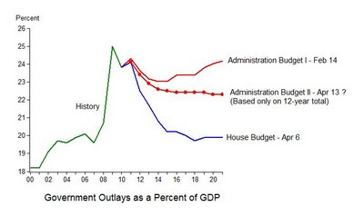
  • There are several implications of these calculations. First, if you view Budget I as an opening to a negotiation and the House Budget as a counter offer, then Budget II has moved in the direction of the counteroffer. But it is a relatively small move compared to the outcome of the 2011 negotiations, where the Administration moved two-thirds ($39 billion of $61 billion) in the direction of the House proposal. But stay tuned.
  • Second, the new Budget still leaves a great deal of the recent spending binge in place, at 22.3 percent of GDP compared with 19.6 percent in 2007.
  • Third, if the Administration wants Budget II to be part of the negotiations, then OMB should either submit a revised budget to replace the one sent to Congress on February 14 or provide the needed transparency in some other way.
Posted in Budget & Debt | Comments Off on Why a Lack of Transparency in the Administration’s Budget II is a Problem

Stanford Economist Jon Levin wins Clark Medal

The American Economic Association has just chosen my colleague Jon Levin to receive the John Bates Clark Medal awarded each year to the best economist under the age of forty. Congratulations Jon! And a good prediction by Justin Lahart of the Wall Street Journal who wrote this about Jon yesterday before the decision was made: “An expert in industrial organization — the study of how firms and markets interact with each other — Levin has done work on subprime lending (before “subprime” was a dirty word), health insurance and internet markets. He also has researched the economics of getting into a top-flight school. In a paper with Christopher Avery, he developed a model of how the early admissions process at selective colleges and universities, where schools are trying to find the applicants who are most enthusiastic about attending, and students are able to signal their enthusiasm by applying for early admission.”

Posted in Teaching Economics | Comments Off on Stanford Economist Jon Levin wins Clark Medal

Why the Budget Agreement is a Game Changer

  • The budget agreement that emerged from last week’s negotiations literally changes the direction of federal spending. As the chart shows the Obama Administration’s proposed increase in discretionary spending for 2011 has been reversed in the course of the negotiations into an actual decrease in discretionary spending. A year ago the Administration’s budget called for an increase in discretionary spending of about $39 billion. Remarkably the agreement calls for a decrease of about the same amount. No one could have predicted such a turn around one year ago.

  • Of course this is the first step of a longer term budget strategy. The next step is the 2012 budget and associated reforms. But this first step helps establish the credibility needed for the budget strategy to increase economic growth and encourage private investment.
  • Note that the data in the chart refer to discretionary budget authority as estimated by the CBO, excluding emergency appropriations, about which there are different scoring conventions. The totals reflect the $78 billion number emphasized by the White House and the $39 billion number emphasized by the House of Representatives.
Posted in Budget & Debt | Comments Off on Why the Budget Agreement is a Game Changer

The Simple Budget Choice: Remove or Lock-In the Spending Binge

  • Much has been written on how the House Budget Resolution for 2012 presented on Tuesday by Paul Ryan compares with the Administration’s Budget for 2012. From a macroeconomic perspective, perhaps the biggest difference is that the House Budget brings outlays as a share of GDP back close to 2007 levels as a share of GDP, thereby removing the large spending increase of the years 2008-2009-2010, while the Administration budget effectively locks in that increase. This is shown clearly in the following graph of outlays as a share of GDP under the two budgets.
  • Thus a simple way to look at the budget debate which the country faces in the months ahead (once the budget for 2011 is settled) is whether to remove or lock-in that binge.
  • The chart also shows that the removal of the binge under the House budget occurs at about the same pace as the increase, which is somewhat faster than the pace of removal in the example Gary Becker, George Shultz and I showed in our Wall Street Journal article of last Monday.
Posted in Budget & Debt | Comments Off on The Simple Budget Choice: Remove or Lock-In the Spending Binge

A Credible Strategy to Reduce Government Spending Growth and Increase Economic Growth

  • In tomorrow’s Wall Street Journal, Gary Becker, George Shultz and I present the economic case for a credible strategy to reduce the growth of federal government spending, bring the deficit down, and increase economic growth. We emphasize the words credible and strategy.
  • The essential first step in the strategy is substantial progress in reducing discretionary spending in 2011. This will help establish credibility and show that government can actually take needed actions, not just promise to take them. Think game-changer.
  • The second part of the strategy is a transparent longer term plan to get total spending (including entitlements) as a share of GDP down gradually to a level consistent with tax revenues generated by the current tax system. Credibility will be enhanced by showing that the needed spending share is close to shares seen in not-so-distant American history and that it is achieved gradually.
  • It’s important for the government to explain to the American people why such a strategy will help increase economic growth and reduce unemployment. This task is made easier by the fact that it is consistent with basic economics in which expectations and incentives figure prominently.
  • The two parts of such a strategy may be emerging from Washington this week in (1) some form of HR1 for 2011 and (2) the 2012 Budget Resolution to be put forth on Tuesday. Stay tuned.
Posted in Fiscal Policy and Reforms | Comments Off on A Credible Strategy to Reduce Government Spending Growth and Increase Economic Growth

Another Round on Investment and Unemployment

  • Paul Krugman responded to my reply (March 31) to his two critiques (afternoon and evening of March 30) of my post (January 14) on the negative correlation between investment and unemployment. He now says that Taylor “professes himself baffled.” Of course I didn’t profess any such thing. I simply showed that that Krugman was wrong.
  • My original post showed that there is a negative correlation between total fixed investment (the sum of residential and nonresidential investment) as a share of GDP and the rate of unemployment over the past two decades. In his March 30 afternoon critique Krugman said that “It’s mostly the housing bust!” and continued that “The rest”—the business fixed investment part—“is just politically motivated mythology.”
  • In my reply I pointed out that, no, it’s not mythology; there is a strong negative correlation between business fixed investment as a share of GDP and the unemployment rate over exactly the same period as in my original post. The investment-unemployment correlation is not mostly housing. Some of the high unemployment now is due to low residential investment as it has been in many past periods of high unemployment. As I said in my original January 14 post, you should look at residential investment plus nonresidential investment.
  • Krugman devotes considerable space in his latest criticism of my January 14 post to comparisons of business investment in the Bush Administration and the Obama Administration as if that was something I did in that post. But I didn’t make such a comparison in my Janaury 14 post. If one is interested, I have found in other empirical work that policies earlier in the 2000s, including the policy that kept interest rates too low for too long in 2003-2005 and the stimulus package of February 2008, were part of what went wrong prior.
Posted in Fiscal Policy and Reforms | Comments Off on Another Round on Investment and Unemployment

Rebalancing Monetary Policy and the G20 Agenda

  • Yesterday’s meeting of the G20 finance ministers in China broadened the ongoing “rebalancing current accounts” agenda to consider international monetary policy reform. But few central bank governors came so an important monetary policy issue could not be discussed: the international rebalancing of monetary policy.
  • The Central Bank Watch Table released today by the economic forecasters at JPMorgan Chase illustrates this imbalance. The table gives the policy interest rate at the major central banks around the world and a forecast of future rates based on a combination of formal economic analysis and listening to central bankers. The table is quite long so I show a small section here for the western hemisphere countries. The shaded part of the table is the quarterly forecast from June 2011 to June 2012.

  • If you click on the whole table you see an amazing thing: The United States is the only country in the world, aside from troubled Japan and dollar-pegged Hong Kong, whose central bank is listed as “On hold” which means not expected to increase the interest rate until June 2012 or later. So there’s an imbalance.
  • Now, just as with current account imbalances, one can say that there are good monetary policy imbalances and bad monetary policy imbalances. In current circumstances the low interest rate in the United States makes it harder for other central banks to combat rising inflation without possibly creating damagingly large appreciations of their currencies. It is not simply a China issue. Many emerging market central bank’s feel the pressure and are intervening or talking about intervening, or even imposing capital controls. What is right for the U.S. is under some dispute now, and the disagreement is showing up in remarks by Fed presidents this week. The Taylor Rule says the rate should already be higher.
  • The IMF is now busy putting together the indicators of current account imbalances for their Mutual Assistance Process (MAP) for consideration when G20 and other countries meet in Washington later this month. Since the central bank governors will be there this time, it would be a good idea to put this table of monetary policy imbalances on the agenda for discussion.
Posted in International Economics | Comments Off on Rebalancing Monetary Policy and the G20 Agenda

Investment and Unemployment over Longer Periods of Time

  • Like Paul Krugman, Justin Wolfers also wrote yesterday about my blog post of January 14 on the correlation between investment and unemployment. Wolfers argues that the relationship did not exist in earlier years. He is wrong.
  • His argument is based on the observation that the scatter of points for the 1990-2010 period, shown in one of my graphs, shifts up and to the right—higher unemployment for a given level of investment—if you include the 1970s and 1980s. The scatter of points shift back down and to the left if you go back further. This shift up in unemployment in the 1970s and 1980s was due in part to the well-documented longer term increase in the natural rate of unemployment in the 1970s and 1980s, which many macroeconomists have researched and written about, but which Wolfers does not mention. When you recognize that such longer-term historical trends exist, you can see that there is a strong correlation between investment and unemployment that goes back before 1990.
  • The time-series plot below goes back to 1960. You can see frequent ups and downs in the investment ratio and most of these are related to the downs and ups in the unemployment rate. The exceptions are mainly due to the secular, longer-term rise and fall in the unemployment rate.
  • If you go beyond the chart and use some statistics, you can confirm these observations and be more pricise. For example, a simple regression of the change in the unemployment rate on the change in the investment ratio has a large and statistically significant coefficient of -.7 with a t-value of -10 over the 50 period.
  • As always in economics there are many factors at work, especially when you consider longer periods. But a longer history confirms the strong correlation I wrote about.
Posted in Regulatory Policy | Comments Off on Investment and Unemployment over Longer Periods of Time