It wasn’t any fun updating my charts this morning with the new data released this week. None of the charts looked better and some looked worse.
The EKG chart showing real GDP growth quarter-by-quarter over the decades remains as tragic and worrisome as ever. You can see the stability of the Great Moderation fading into the past, followed by the Great Recession and now by the Not-So-Great-Recovery. 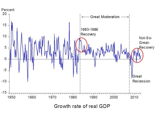
I argue that the Great Moderation’s demise came from a Great Deviation of policy from what worked well in the 1980s, 1990s, and until recently. There’s a Great Debate over that view, of course, but it gives a reason for some optimism. If the poor economic performance is caused by policy, it can be reversed by a change in policy.
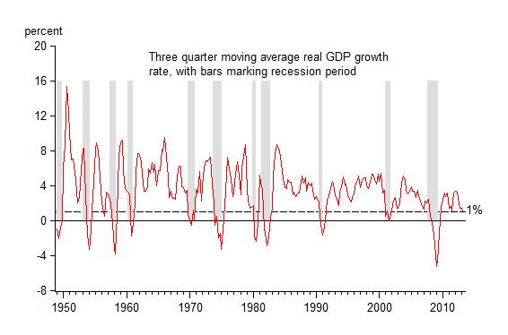
The bar chart shows how the growth rate in the Not-So-Great-Recovery compares with the 1980s. The average growth rate over the past four years–little changed with the revised data (2.2% compared with 2.1%)–is still much lower than the 5.2% in the comparable four years of the 1980s recovery. But we now see that we had a near double dip recession in the first quarter of 2011, and that growth in the first three quarters of 2011 was only 1.1 percent.

The worrisome part is that growth in the past three quarters was even lower. You have to go back 6 decades (to 1956Q3) to find a slower three quarter growth rate that was not part of an actual recession! I illustrate this in the next chart which shows 3-quarter average growth with recessions marked off.
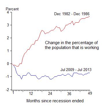
Finally, the chart of the change in the employment-to-population ratio—the percentage of working age population that is actually working—still reveals no sign of a takeoff. The ratio is still lower than at the start of the recovery. The increase in jobs is not enough to employ a greater fraction of the working population. The labor force participation rate has continued to decline.