So far the fiscal cliff debate has mainly been about whether tax revenues should be on or off the table with little mention of spending. But the economics of the debate—as distinct from the raw politics—make no sense without considering spending. And whenever spending is mentioned, it’s in terms of gargantuan ten-year totals like 2 or 3 trillion dollars, which are meaningless to most people and sweep under the rug key questions about the size of government and the speed of adjustment.
So consider an alternative way to present and discuss spending proposals. It involves the following chart, and while not everyone likes to use charts, this one is far more digestible than those multitrillion dollar sums thrown around. And it suggests away to avoid the fiscal cliff.
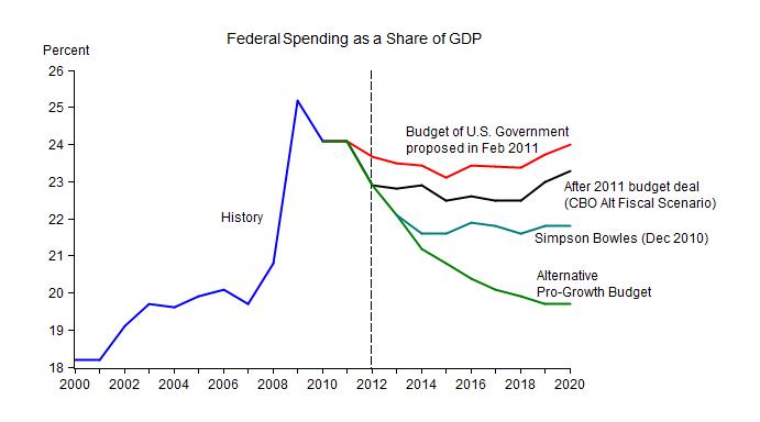
Starting on the lower left of the chart a history line shows the sharp rise in federal spending as a share of GDP from the year 2000 to the present. It then splits into four lines corresponding to different year-by year spending paths which were proposed in the months leading up to the budget deal of last year:
- The top line is the Administration’s spending proposal made in February 2011.
- The next line shows the result of the budget deal of the summer of 2011, but it does not include the additional sequestration reductions that were part of the deal.
- The third line is the Simpson-Bowles spending proposal which was put forth in their December 2010 report.
- The fourth line is a “pro-growth” proposal made by Gary Becker, George Shultz and me in the Wall Street Journal on April 4, 2011.
- Two other proposals worth noting on the chart:
- spending with sequester cuts from the 2011 deal; it’s close to Simpson-Bowles
- the House Budget resolution of March 2012; it’s close to the pro-growth line.
Note that although federal spending as a share of GDP declines for the pro-growth and Simpson-Bowles paths, actual spending rises at 3.3 % per year and 4.8% per year respectively.
When looked at in this way, the logic of the pro-growth proposal jumps out at you:
- First, the proposal simply reverses the recent spending surge by bringing spending to 2007 shares of GDP, still well above levels at the end of the Clinton Administration.
- Second, the reversal is very gradual; substantially more gradual than the rapid run up in spending. This gives people a chance to adjust. In fact, macro model simulations show that this gradual spending reduction will increase economic growth even in the short run.
- Third, the spending reduction will lead to a balanced budget without tax increases, because the budget was nearly in balance in 2007. This is why it’s called the pro-growth path, and it also allows for static revenue neutral tax reform which will raise growth further.
For those who want a bigger government than implied by the pro-growth path, the chart points to a good way to avoid the fiscal cliff without creating another:
(1) Agree now, during the lame duck session, to spending as in the Simpson-Bowles proposal. That is sequester spending levels without the damaging cliff-like sequester. Most members of Congress are familiar with the proposal making it easier to pass during the lame duck session.
(2) Postpone all scheduled income tax increases until a negotiation over tax reform is completed in the next Congress. There the key issue will be whether to increase taxes to pay for the higher spending levels in Simpson Bowles, or to keep spending at 2007 levels as a share of GDP without tax increases, or somewhere in between. Agreeing to the Simpson Bowles spending levels now in order to avoid the cliff shouldn’t give either side additional bargaining power after the cliff.