It’s only 87 pages long–about the same length as a good book on the economic crisis–and there are some great charts.
I put together some charts to get started. In these charts I compare the Ryan Roadmap with the road America is currently on, according the CBO’s latest estimate of June 30, 2010. CBO calls the current road the Alternative Fiscal Scenario. Road to Ruin is a better description.
The first chart compares federal debt as a share of GDP under the CBO Alternative with the Roadmap; the Roadmap obviously makes more sense. 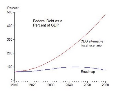 The second chart shows spending and taxes under the Roadmap and the CBO Alternative; the Ryan Roadmap focuses on controlling the growth of spending as a share of GDP, which makes sense because that is where the growth of the deficit is coming from.
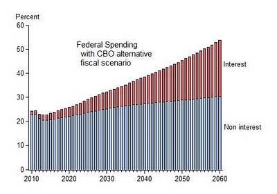
 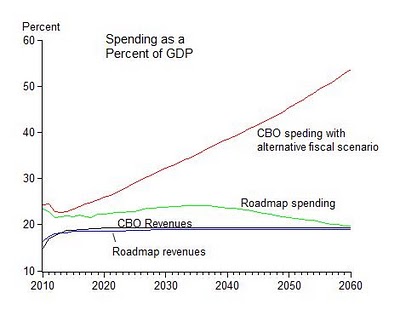 The third and fourth charts show how the Ryan Roadmap takes action to control non-interest spending now and thereby dramatically reduces interest payments on the debt in the future.
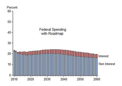
There are alternative plans of course, but at the very least the facts shown in these charts demonstarte that the Ryan Roadmap is a big improvement over the road we are on now.