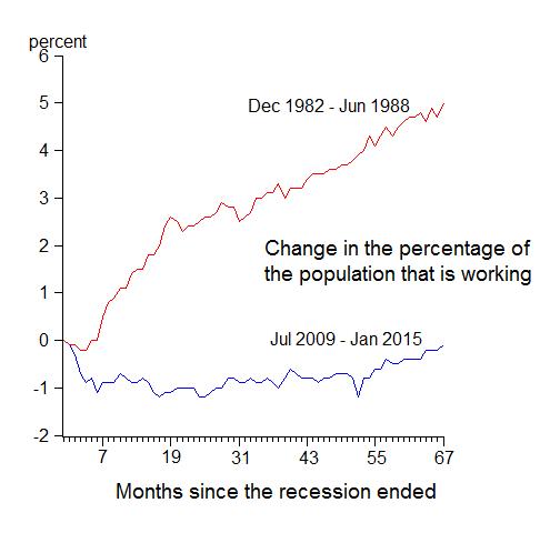
I’ve been tracking the economic recovery with charts and commentaries on this blog since it began in 2009. The simplest but most revealing charts compared and contrasted this recovery with the recovery of the 1980s. Here’s an update of two of those charts. The first shows the change in the employment-to-population ratio,
and the second shows the growth rate of real GDP for the two recoveries.
One can’t help but notice the enormous difference back at the start of this recovery, but the difference has persisted year after year for going on six years now.
At the time of the first anniversary of current recovery in 2010, it showed clear signs of weakness compared to the recovery from the recessions in the early 1980s and from all other deep recessions in American history. Some said it was a natural occurrence because of the depth of the recession, but Milton Friedman long ago showed that there was nothing natural about it.
By the recovery’s second anniversary in 2011, it was weak for long enough that I called it “a recovery in name only, so weak as to be nonexistent.” Still some said it was not so bad given the depth of the recession, but research by Mike Bordo and others verified that something unusual was going on.
By the recovery’s third anniversary in 2012, it was now the worst recovery from a deep recession in American history. Some still disputed that but an analysis of the data in these charts showed we clearly had a problem on our hands. In my view the problem was economic policy and I wrote First Principles to explain that view.
By the recovery’s fourth anniversary in 2013, few disputed any more that it was unusually weak and disappointing. But rather than consider government policy as the cause, other explanations arose, such Larry Summers’ “secular stagnation” (see Chapter 2 of Baily-Taylor) which took the economic commentary world by storm.
By the recovery’s fifth anniversary, we were so far away from the recession that linking the terrible performance to the recession became increasing far-fetched. The sarcastic sounding “not-so-great-recovery” had become a favorite label, and the “it’s policy” versus “it’s secular” debate continued.
With the recovery now approaching its sixth anniversary, there is more optimism that we are finally coming out the excruciating slow growth. There is also some wishful thinking that the drop of people out of the labor force—which has made the unemployment rate come down—is due to demographic factors not the slow growth itself. And we are not as bad as Europe.
But as these charts show there is still not much in this recovery to write home about. Growth over the four quarters of 2014 looks to average only 2.2% compared with 4.4% in the corresponding quarters of the 1980s recovery. And as of January 2015 the employment-to-population ratio is still lower than at the start of the recovery.


