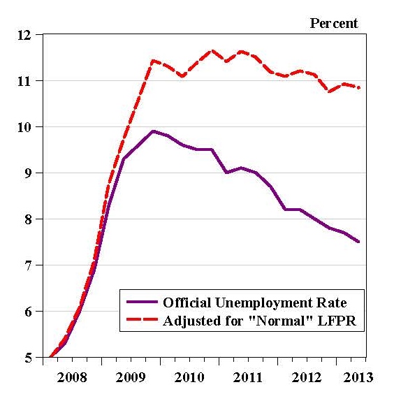
Research by Christopher Erceg and Andrew Levin is providing solid evidence that the decline in the labor force participation rate since 2007 has been due to cyclical factors–the recession and slow recovery–rather than to demographic factors. In other words, the fact that such a large number of people have dropped out of the labor force is associated with the weak economy rather than to their reaching their retirement years–or some other typical demographic trend. Because the unemployment rate does not count the people who dropped out of the labor force it no longer gives a good reading of the state of the labor market. The unemployment rate would be much higher without this large decline in labor force participation.
In the latest version of their paper Chris and Andy estimate how large the US unemployment rate would be without this abnormal decline in the labor force, and they produced this amazing chart which summarizes their findings (I tweeted about this yesterday).
That the actual unemployment rate has become such a poor indicator of labor market trends is one reason why many economists have focused on the employment to population ratio. Here is an update of a chart I have been using for several years to illustrate the lack of progress in employing the working age population compared to recoveries from previous deep recessions, such as the recovery from the recessions in the early 1980s. It too is an amazing chart.

There is no longer debate that the labor market performance in this recovery–and the recovery itself–is unusually weak. The debate is now over why. I have argued that it is the economic policy.